


 EN
 ไทย


Customers Also Purchased
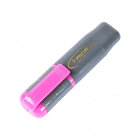
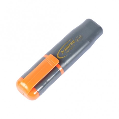
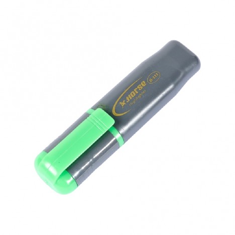
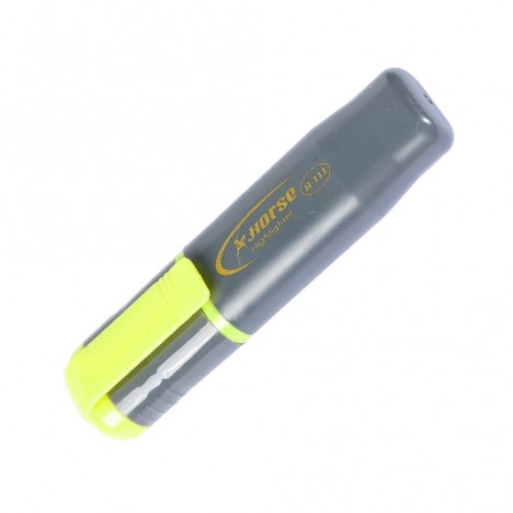
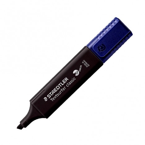
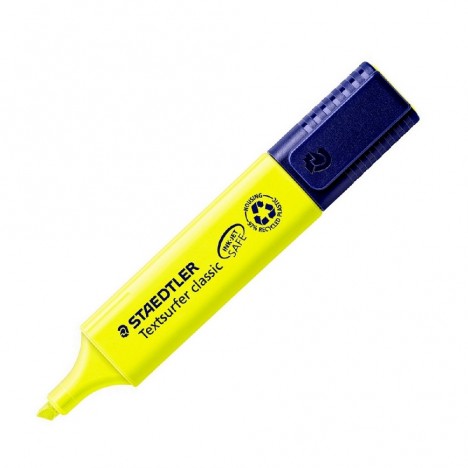
During periods of intense exam studying, you might have nearly a dozen highlighter colors on your desk, but ultimately only use two or three. The rest just sit there unused because the colors don't really help. Some colors look great when purchased, but end up being too loud on paper, causing eye strain, while others are so light they are barely noticeable.
When you open the book to review later, you might be confused as to why nearly every line is highlighted, making it impossible to tell what is actually important. What was supposed to aid memory retention instead makes the page cluttered and harder to read.
Many people have probably experienced this, whether they are students or professionals who need to read a lot of documents. Choosing colors you simply like, colors that look pretty, or buying a set just because it was a good deal, only to find later that some colors cause eye fatigue over large areas, some bleed through the paper and stain the other side, some are too faint to stand out, or that having too many colors leads to haphazard highlighting that ruins your organized system on day one.
In fact, Highlighters There is no single formula for which color is best for everyone. Instead, it depends on your specific use case, including eye-friendly colors, the type of paper you frequently use, and your actual highlighting style—whether you highlight a lot or a little, and whether you use a single color or color-code by category. This article will walk you through each factor step-by-step so you can make the right choice for your actual needs.

Which highlighter color is best starts with what you are using it for
Before choosing a color, ask yourself what kind of work you mainly use it for, because the answer will tell you which colors and pen tips you should choose.
- Studying for exams You should choose colors that clearly separate information. For example, use one color to emphasize the main point, another for definitions, and another to mark points you don't understand yet or need to review. This way, when you open the book later, you'll immediately know what each color means.
- General document work You should choose colors that are easy to read and do not make the document look cluttered. Yellow, green, or light blue usually work well in this case.
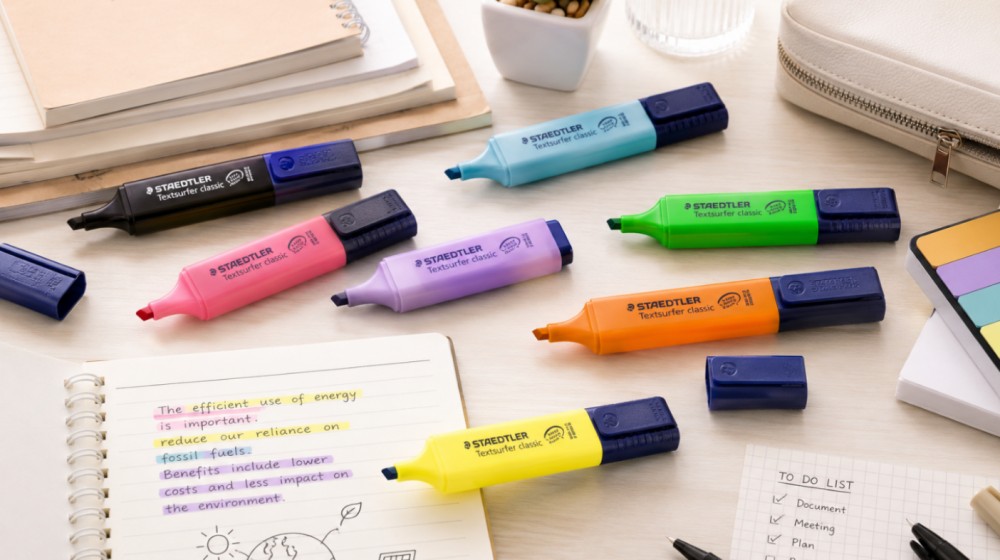
- Taking notes or summarizing in a planner Pastel colors are more suitable because they look soft, are easy on the eyes, and allow you to use multiple colors on the same page without feeling crowded or overly glaring.
- Proofreading or highlighting caution points Pink or orange catches the eye well, but should only be used for truly important points. If you highlight the entire page, it's no different from not highlighting at all.
A good highlighter is not just about looking nice when you swipe it, but about allowing you to grasp key points immediately when you reopen the page without having to reread the whole thing.
Does highlighter color really help you remember?
To put it simply, color doesn't automatically make you remember things, but it helps organize information better and makes reviewing easier, which is what truly aids memory.
If you use colors systematically—such as yellow for main ideas, pink for points to memorize, blue for examples, or green for conclusions—reopening the page allows you to immediately see information categories without having to reread everything from scratch. However, if you use too many colors or highlight every line until the page is full, it's equivalent to highlighting nothing at all, because everything looks important and you ultimately can't distinguish what to remember first.
Highlighting is therefore most effective when combined with reading for understanding, summarizing in your own words, and reviewing repeatedly—not just coloring lines and hoping you will automatically remember.
Yellow: The most basic, easiest-to-use color
If you don't know where to start, yellow is the essential color you should have first. It is the basic highlighter color that is easy to use, highly visible, and suitable for many types of work.
The reason yellow is easy to use is that it naturally contrasts well with black text, doesn't make reading harder, and is ideal for highlighting things you need to review—whether key points, definitions, or major topics. However, being easy to use doesn't mean you can highlight without limits. If the whole page turns yellow, you won't know which points are truly important anymore.
A more effective approach is to use yellow as the "primary color" and then bring in other colors to separate specific details. This alone makes the page easier to read without needing excessive highlighting.

Pink and orange are suitable for spots you want to catch the eye
These two colors stand out much more distinctly than yellow and green. When you open a page, your eyes will immediately go to the points highlighted in pink or orange. They are ideal for dates, numbers, formulas, warnings, or points that require special memorization. However, for the same reason, if used too much, the page can easily look cluttered and strain the eyes, especially with vivid or fluorescent tones. These two colors are therefore better suited for the role of "special accents" rather than the main color.
Take reading for exams as an example: use orange for numbers, dates, or key formulas, and reserve pink for vocabulary or frequently tested topics. Just by defining their roles clearly like this, each color carries its own meaning, and the page won't become unnecessarily cluttered.
Green is suitable for conclusions or information that needs to be separated out
Green sits right in the middle between being very prominent and too soft. It is clearly visible without feeling as intense as pink or orange. It is ideal for highlighting conclusions, answers, or information that needs to be separated from the main text without making the page look chaotic.
Some people use green to mean "understood" or "this is the conclusion." For example, after finishing a topic, they highlight the summary sentence at the end of the paragraph in green. When returning to re-read, they can grasp the main points quickly without having to re-read everything from scratch. For paperwork, it also works well for marking checked items or passed points without being too overwhelming.
There are no set rules for what colors must mean. However, if you use green for conclusions, the key is consistency. A good system isn't a complex one, but one that you can immediately understand whenever you re-read it.
Blue and purple are suitable for supplementary information, notes, and categorization
Blue and purple are great colors for categorizing information because they aren't as intensely striking as orange or pink, yet they still help visually distinguish sections on the page.
Blue is suitable for supplementary information, examples, notes, or points you want to revisit, such as highlighting illustrative examples or details that help you better understand the main topic.
Purple is suitable for subtopics, technical terms, or information you want to separate from the main content. Some shades of purple feel distinct without being overly vivid, making them ideal for summary notebooks or notes that require a neat organization.
Using blue or purple alongside yellow helps the page look more organized. For instance, yellow can be used for key ideas, while blue or purple is used for supporting details related to that content.
What is the difference between pastel and fluorescent colors?
Commonly found highlighters can roughly be divided into two styles, each suited for different uses.
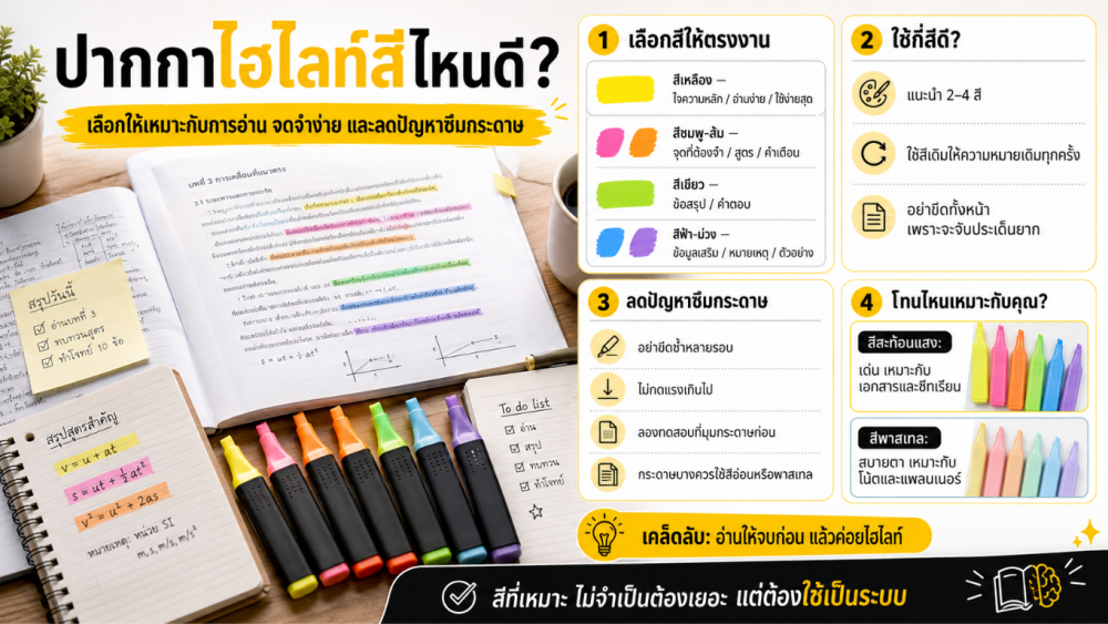
Fluorescent colors, such as neon yellow, neon green, neon orange, or neon pink, stand out and are immediately noticeable. They are suitable for documents, lecture sheets, or reviewing work where you need key points to pop out quickly. However, using too much can make the page look crowded and easily cause eye strain.
Pastel colors offer a softer feel, making them ideal for note-taking, making summaries, planner notebooks, or long reading sessions, as using multiple colors on the same page won't be harsh on the eyes. The downside is that some shades might not stand out enough on text-heavy documents or when you truly need something eye-catching.
In practice, you don't have to choose just one style. Many people use fluorescent colors to emphasize key points in documents and pastel colors for notes or summaries that need to be reviewed repeatedly. Both styles serve different purposes and can easily be used together.
How to choose highlighters to reduce bleed-through
One common issue many encounter is ink bleeding through the paper or ghosting to the other side, especially when used on thin notebooks, textbooks, or photocopy paper.
First of all, you need to distinguish between "ghosting" (shadow showing through) and "bleeding through"—they are not the same. Seeing a faint shadow from the other side may just be due to thin paper or dark ink, but the ink hasn't actually seeped through. Bleeding through, on the other hand, means the ink penetrates to the other side of the page, causing smudges or making it hard to write on. These two issues require different solutions.
Bleed-through depends on several factors simultaneously: the type of ink, the ink flow rate from the nib, paper thickness, and drawing over the same spot multiple times. Therefore, no highlighter can guarantee zero bleed-through on all types of paper.
If you want to reduce the risk of bleed-through, consider the following:
- Choose colors that are not too dark When used on thin paper, light or pastel colors help prevent marks from showing as prominently on the back compared to dark colors, though this doesn't always guarantee zero bleed-through since other factors also play a role.
- Avoid highlighting over the same spot multiple times Going over the same spot repeatedly causes ink to pool and increases the chance of bleeding through. One stroke is enough.
- Do not press too hard Pressing hard does not make highlighting better; it only causes excess ink to flow out and can easily damage delicate, thin paper.
- Test on a corner of the page before actual use For important books or documents, always test in a small corner first, especially when using paper you haven't tested before.

Which highlighter tip style is right for your use?
In addition to color, the shape of the tip significantly impacts ease of use and the neatness of your work.
Chisel tip This is the style most people are familiar with, ideal for highlighting full lines of text in documents, textbooks, or study sheets. Its key feature is using the broad side to quickly highlight an entire line of text and rotating to the narrow edge to underline or emphasize short words with the same pen.
Bullet/Pen-style tip Offers a feel similar to using a colored pen and gives you easier line control. It is suitable for note-taking, making summaries, or working in notebooks with limited space. If your primary focus is planners or lesson summaries requiring fine, detailed lines, this style is definitely a better choice than a chisel tip.
If you have diverse needs, having both styles is a great idea: use chisel tips for documents and books, and pen-style tips for notebooks and memos, dividing their roles perfectly.
How many highlighter colors should you use?
Having multiple colors isn't a bad thing, but using too many without a system will make the page look cluttered and harder to read than if you hadn't highlighted anything at all. A good balance for reading books or taking summary notes is around 2–4 colors—enough to categorize information, but not so many that you forget what each color means.
Simple, practical categorization examples
- Yellow Main idea
- Pink or orange Points that need special memorization
- Green Conclusions or answers
- Blue or purple Supplementary info, notes, or examples
This is not a hard-and-fast rule; anyone can define their own color meanings. However, what matters more than color choice is consistency. If today you decide green represents conclusions, stick with that every time. A good system isn't necessarily perfect, but one that lets you instantly understand the content upon re-reading.
Techniques for using highlighters to make reviewing easier
Highlighters are truly useful only when combined with the right reading method, not just marking everything that seems important.
1. Finish reading a paragraph or section first before going back to highlight. If you highlight while reading from the start, you won't know which parts are truly key, inevitably leading to over-highlighting.
2. After highlighting, write a brief summary in your own words. For example, highlight a definition in yellow and jot down next to it "what it means" or "easy-to-remember gist." This way, you aren't just seeing the text, but actively thinking and understanding the material.
For exam prep, highlighting is just the starting point, not the end. It should be used alongside summarizing, making flashcards, or practicing questions, because effective retention comes from active retrieval and repetition, not the color itself.
What to consider before buying highlighters
When purchasing, don't just look for colors you like; consider what kind of tasks you'll be using them for.
- Mainly for documents or books: Chisel tips are more suitable because they highlight lines quickly and cover text height well. For notebooks or planners: Pen-style shapes are easier to control, ideal for underlining thin lines or adding written annotations.
- For long reading sessions, pastel or softer shades are easier on the eyes than bright neon tones. For thin paper, choose shades that aren't overly saturated and test them beforehand, as bleed-through depends on the paper as much as the pen.
- Even if you have diverse tasks, you don't need every color. Having two or three basic colors with distinct roles is sufficient—for instance, yellow for the main idea, pink or orange for key memorization points, and blue or green for secondary details.
Ultimately, the best highlighter isn't the most expensive one or the set with the most colors, but the one that truly fits your working style.
Which highlighter color to choose? The right pick makes everyday use much easier
If you ask which color is best, the answer is that there is no single best color for everyone, but rather colors suited to each person's specific tasks.
To summarize briefly: yellow is the primary essential color you should have first; pink or orange is ideal for points that require special memorization; green is used to separate conclusions; blue or purple is for supplementary information; and gray or black is better suited for specialized tasks rather than as primary colors.
Highlighters A good highlighter isn't just about pretty or vivid colors, but about colors that make reading easier, help grasp key points better, and allow immediate comprehension when re-reading. If you choose the right colors, avoid overusing them, and highlight only what truly matters, an ordinary highlighter can make reading and note-taking far more organized than you might think.