


 EN
 ไทย


Customers Also Purchased
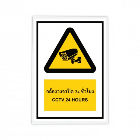
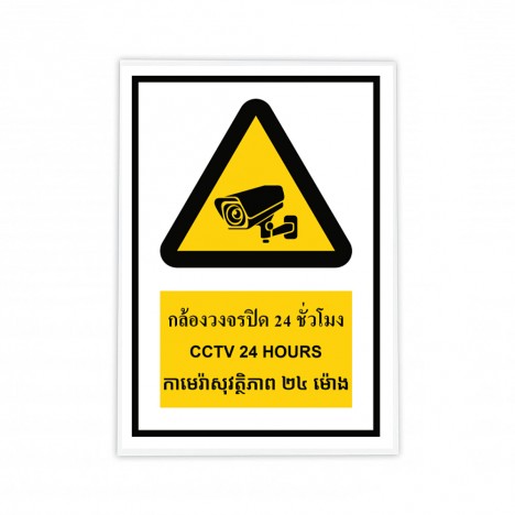
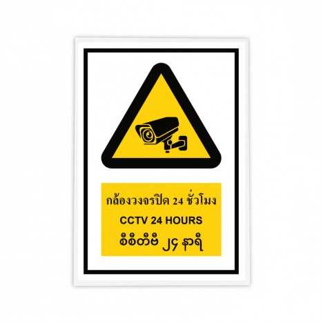
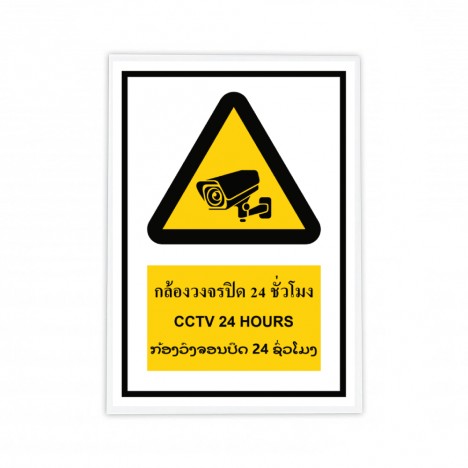
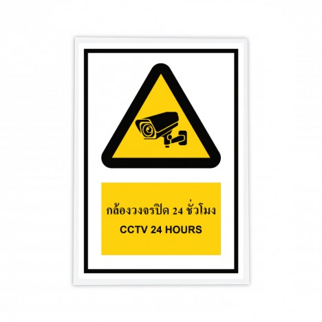
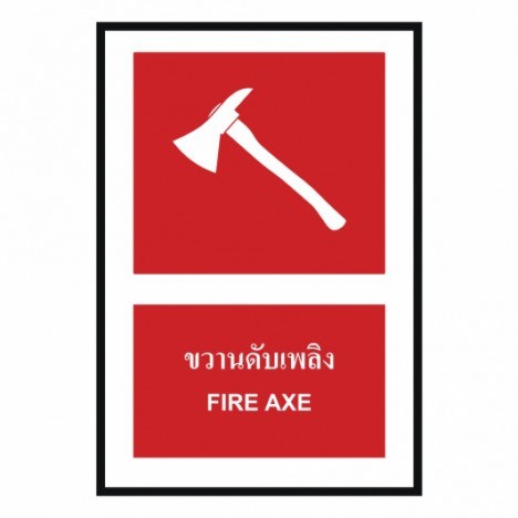
Have you ever noticed? Serious accidents often happen because of the words "didn't know" or "didn't see it in time"—especially in busy factories or bustling job sites. Safety Signs are often overlooked as mere regulatory decorations, but in emergency seconds, these signs are heroes that help decide for us whether to "go ahead" or "back off."
In this article, we invite you to shift your perspective. Let's explore why a global standard like ISO 7010 matters, and what meanings are hidden behind the colors and shapes. We will decode these safety signs together!
What is ISO 7010 and Why Does It Matter Globally?
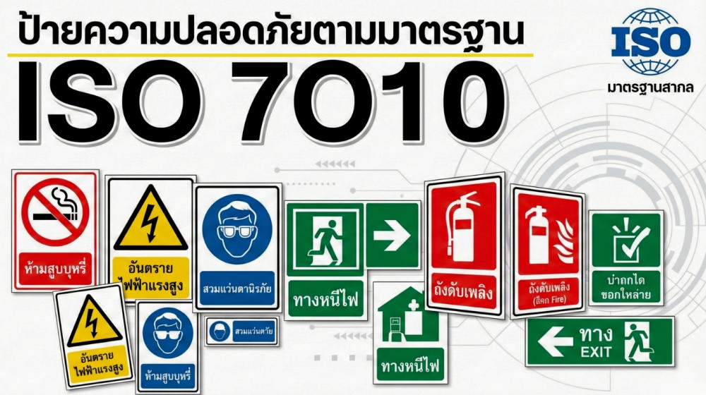
ISO 7010 is an international standard that specifies the format of safety signs, including colors, shapes, and graphical symbols, ensuring that safety communication is consistent worldwide. The highlight of this standard is its primary use of imagery, reducing reliance on text or language so that anyone, regardless of nationality or language, can immediately understand the meaning of safety signs.
In real-world applications, especially in factories or job sites with a multinational workforce, we clearly see that safety signs with text in just one language are practically useless. But once switched to ISO 7010-compliant signs, communication improves dramatically—people visibly stop, look, and exercise greater caution.
Another reason ISO 7010 is widely recognized is that it is referenced alongside occupational health and safety management systems like ISO 45001, as well as labor regulations in many countries. This allows organizations adopting this standard to operate with greater confidence in both safety and corporate reputation.
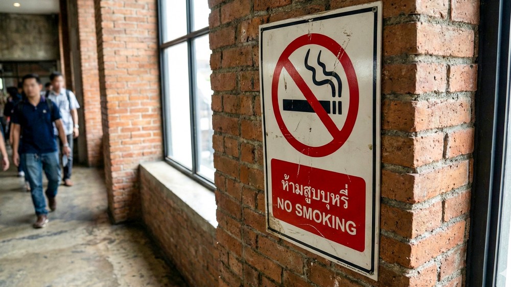
Understanding the Language of ISO 7010 Safety Signs Through Colors and Shapes
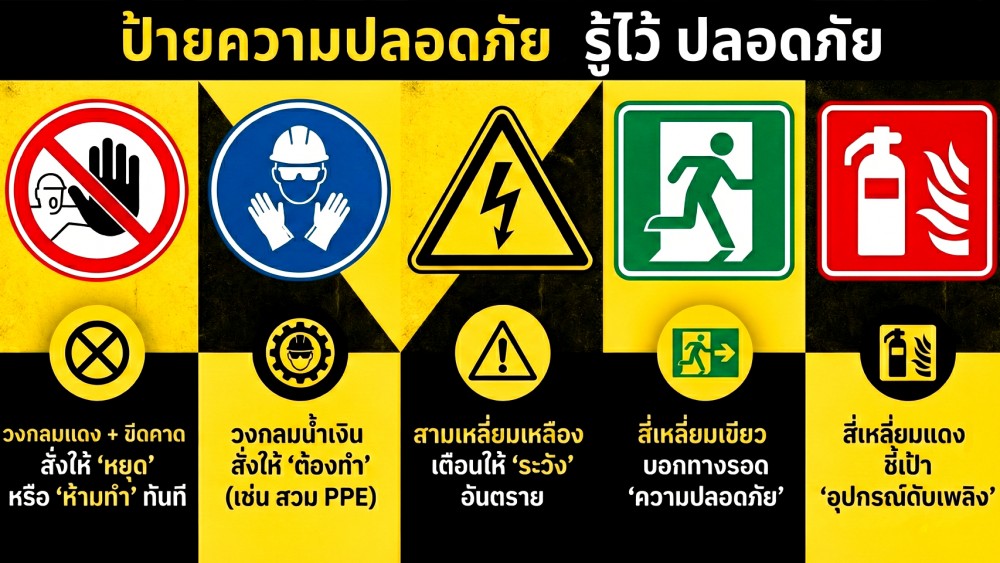
Before we dive deep into each type of safety sign, I'd like to lay the groundwork regarding the "secret code of ISO 7010" so we are all on the same page. This is the key that helps you "read" signs in a split second without wasting time deciphering words. The core of this system is using colors and shapes to convey meaning, specifically designed to trigger human instinct.
- Red circle + diagonal slash: Commands an immediate "stop" or "prohibition"
- Blue circle: Commands a "mandatory action" (e.g., wear PPE)
- Yellow Triangle: Warns to 'Be Careful' of Danger
- Green Square: Indicates 'Safety' Escape Routes
- Red Square: Pinpoints 'Fire-Fighting Equipment'
From actual on-site experience, this is no small matter... because in an emergency situation, the human brain processes 'colors and shapes' many times faster than 'text'.
Safety Signs: Prohibition Signs
A safety sign characterized by a red circle with a diagonal slash over a black symbol on a white background is an international symbol screaming "Stop right now!" It is not a request, nor is it advice; it is a mandatory rule that must be followed immediately.
We are often familiar with signs like No Smoking, No Open Flames, or Do Not Use Water to Extinguish Fires. However, from our experience and discussions, we found that the critical factor is not how nice the safety sign looks, but rather its installation location.
For this type of safety sign to be most effective, it must be installed only at 'decision points'. For example, placing a 'No Entry' sign at eye level before a hand can reach the doorknob, or placing a 'Do Not Switch On' sign directly on the circuit breaker. Because if installed in the wrong spot, placed too high above eye level, or hidden in a blind corner, even an ISO 7010 standard sign essentially becomes just a useless sheet of plastic.
Safety Signs: Mandatory Signs
Mandatory sign: Blue circle... A signal indicating that you 'must be ready' before starting work. If a red safety sign means 'prohibited', this blue circular safety sign with a white symbol is a command that says "must do". It sets the basic safety conditions that workers cannot ignore.
We often see these safety signs in front of production lines or machinery zones, such as Wear Safety Helmet, Wear Safety Glasses, or Wear Ear Muffs. Spots where mandatory signs are clearly posted at eye level have significantly lower rates of safety rule violations than spots without signs.
Because in the chaotic hustle of the job site, 'forgetting' happens easily. But a clear, prominent blue safety sign serves as a 'Visual Reminder' or a last-second alert, helping turn the excuse of 'I didn't know' into automatically putting on the equipment.
Safety Signs: Warning Signs
Warning sign: Yellow triangle... A signal that triggers the instinct of hazard awareness. The distinguishing feature of this safety sign is an equilateral triangle with a yellow background and a black border. Psychologically, yellow is the color that stimulates the nervous system the most. It does not order you to "stop" like red does, but rather tells you "Caution! Danger ahead", such as Caution: Electric Shock, Caution: Forklifts, or Caution: Chemicals.
Let's take a classic case we often encounter: machinery wash areas. Originally, the floor here was wet all the time, and walking employees slipped and fell regularly to the point where it became normal for people to complain without fixing it... until a "Caution: Slippery Floor" warning sign was seriously installed at eye level.
Would you believe that the floor condition was just as wet as before, but accidents dropped drastically to almost zero? That's because the yellow safety sign works to change human behavior the moment they see it. This is the power of proper risk communication.
Safety and Escape Signs (Safe Condition Signs)
Safe Condition Signs: The green of survival... that must be 100% free of obstacles. An easily noticeable feature of this safety sign is a green square background with a white symbol, signifying an "escape route" or "safety", such as fire exits, first aid stations, etc.
In a crisis where everyone is panicking, the human brain searches for an anchor that conveys safety, and green serves that purpose best. However, from on-site experience, what is scarier than having no sign is having a sign that leads to a dead end. We frequently see factories that properly install 'Emergency Exit' signs, but the actual walkway is blocked by pallets, or 'Emergency Eyewash' signs that have piles of items stacked up blocking access. Remember... no matter how world-standard a sign is, it cannot save anyone's life if the route to safety is "not genuinely usable" in critical life-or-death moments.
Safety Signs: Fire Safety Signs
Safety Signs: The Red Color of Hope... That Must Be Visible in a Split Second. It is characterized by a red square background with a white symbol, signifying the "Location of Firefighting Equipment" such as fire extinguishers, fire hose reels, or fire alarm call points. In a fire emergency, we aren't racing against the heat; we are racing against "time"... Smoke can engulf an area in pitch darkness within minutes. If fire extinguisher signs are unclear, mounted too high, or obstructed by stacked goods, it is equivalent to throwing away our own chances of survival.
From a real-world case we witnessed, we were quite impressed: a factory had installed photoluminescent red signs, allowing even panicked new employees or visitors who didn't know what to do to spot the target and immediately run to grab a fire extinguisher. This is the true value of signs designed to 'save lives'—not just to be mounted for show.
How to Effectively Select and Use ISO 7010 Safety Signs
We discovered a truth... choosing the most effective safety signs does not start with opening a catalog and pointing at options, but must start from the actual on-site risks.
Don't install safety signs just to complete a checklist; install them to 'guide decisions' at critical moments. The best sign is one located in the right position, visible at the right time, and aligned properly with on-site behavior. Always remember that the ISO 7010 standard is a powerful tool, but what gives it real efficacy is your 'vision' in placing the signs so they can work for you 24 hours a day."
Conclusion
Finally, if you ask us how important ISO 7010 is, the answer is: it doesn't make a place immediately safer, but it helps people make better decisions during crucial moments, and that is what truly reduces accidents. Investing in standardized safety signs is not a wasted expense, but an investment in protecting workers and building a sustainable, long-term safety culture.
Select Safety Signs here