


 EN
 ไทย


Customers Also Purchased
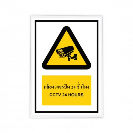
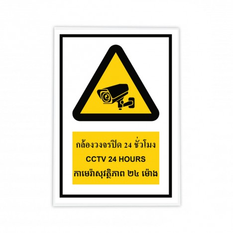
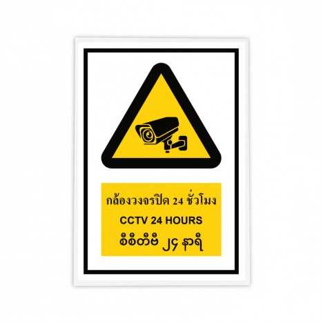
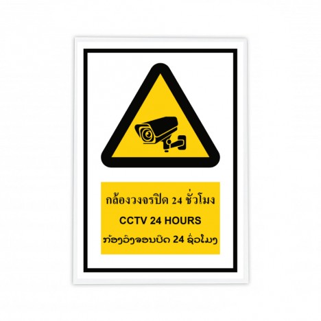
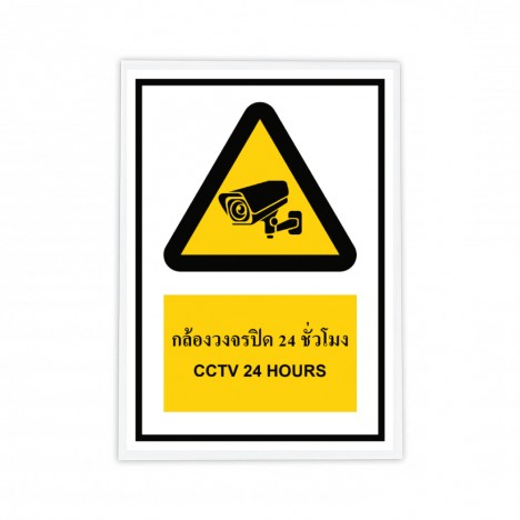
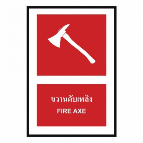
Close your eyes and picture this with us... you are standing in the middle of an automotive parts production line, or perhaps a condominium construction site, surrounded by Safety Signs various colors—whether red, yellow, blue, or green—sometimes lined up so closely that you barely know what to look at first. The question is... do we really see them, or do we just walk past them as if they have simply become part of the background?
In this article, we won't bore you with technical talk about ISO 7010 or TIS standards. Instead, we'll take you on an exploration of "color," because color isn't there just to comply with regulations—it significantly affects workers' split-second decisions.
Why Do Safety Signs Need Colors?
Red Safety Signs: Stop Immediately or Just Accustomed to the Sight?
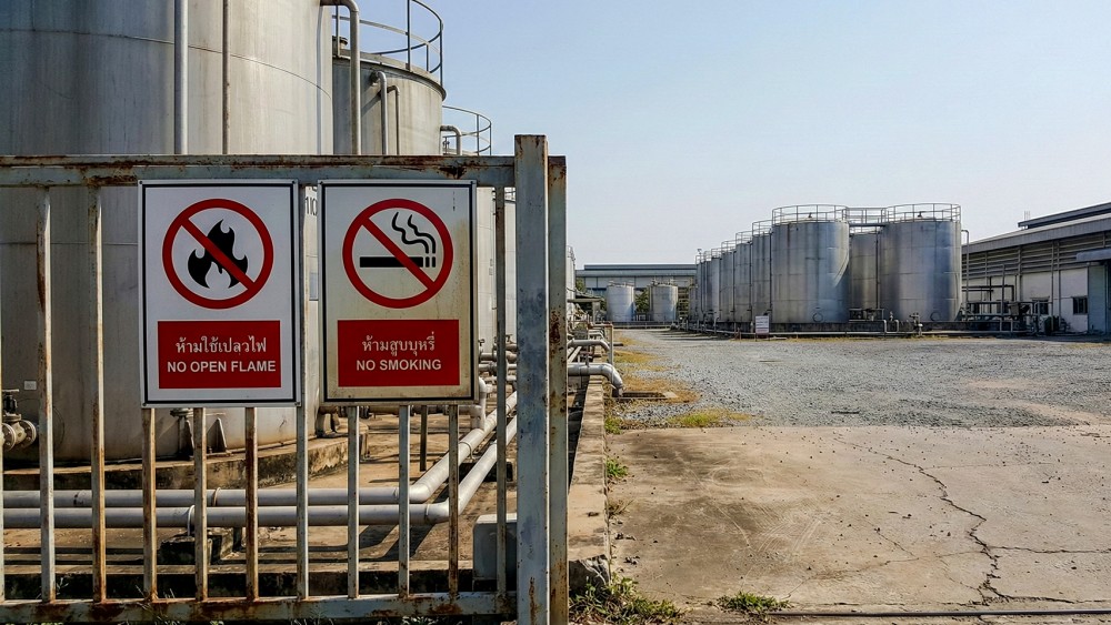
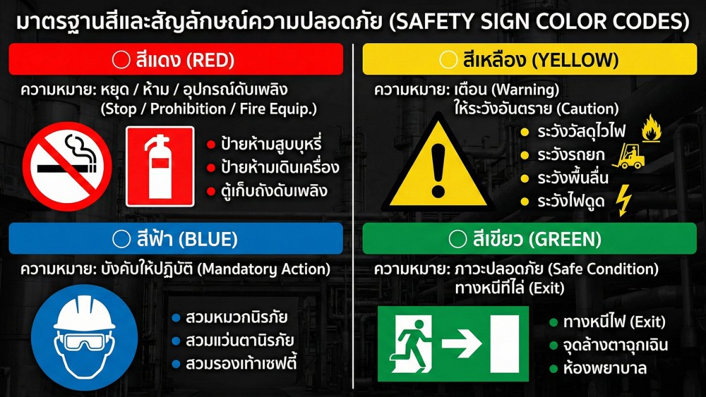
Red safety signs are used for prohibition and critical hazard warnings, such as No Entry, Do Not Touch, or Stop Machine Before Servicing. In theory, red is the fastest color to trigger human emotion and alertness. The brain instantly interprets it as "something is wrong here" and dictates that one must stop or back away before thinking about anything else.
However, in actual job sites, we often encounter the exact opposite. Many factories use red almost everywhere—from small safety signs to safety signs that should genuinely indicate severe danger—until red eventually becomes like the background color of that area. After walking through it for a while, the brain gets accustomed to it and automatically stops prioritizing it.
A technician once told us that at first, seeing red safety signs made him cautious, but after working for a while with red everywhere around him, he began to feel that "if it were truly dangerous, they wouldn't plaster them everywhere like this." This is precisely where red begins to work against its intended purpose.
Therefore, the problem is not that red is bad, but that it is used without prioritizing severity. Red safety signs should be reserved for hazards where failure to stop will likely result in a truly severe accident, such as areas with operating machinery, high-voltage locations, or strictly prohibited entry zones.
If everything uses red, red will no longer alert anyone to anything. Conversely, if used only at truly critical points, red will regain its power and fulfill its purpose as it should.
Yellow Safety Signs: Caution, or a Reminder to Think Before Acting?
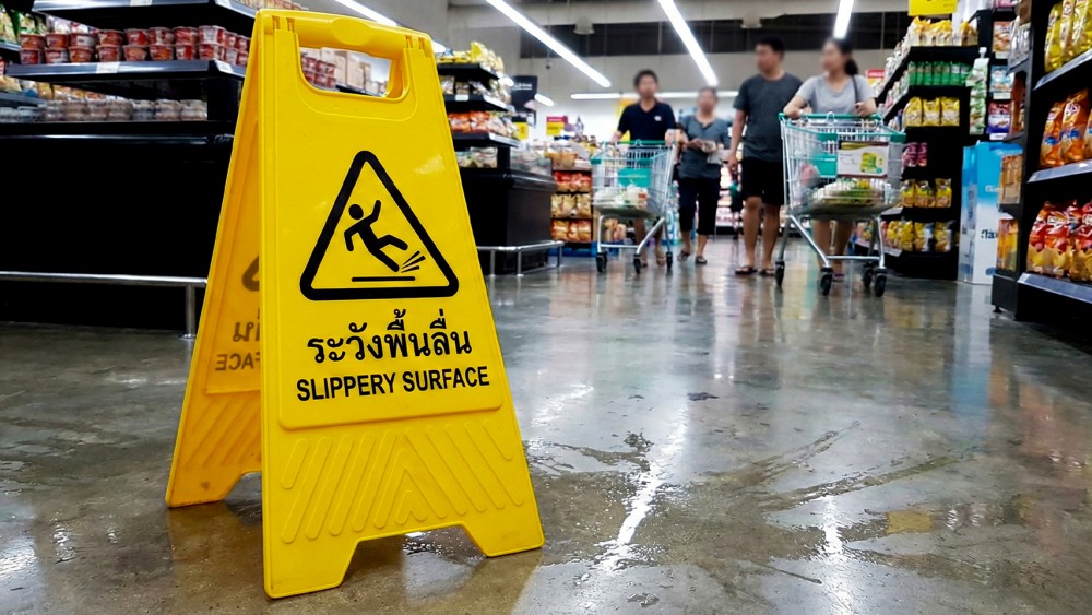
Yellow safety signs are typically used for hazard warnings, such as electrical hazards, slip hazards, or moving machinery. This color of safety sign does not command an immediate stop like a red safety sign, but rather acts like a subtle alert that tells the brain, "stay sharp here," and encourages thinking before acting.
Behaviorally, yellow is the color of slowing down, not slamming on the brakes. It is suited for situations where risk is not present at all times, but can arise if one is careless, such as temporarily wet floors, intermittently moving machinery, or areas with cross-traffic.
From our experience, yellow safety signs work very well in areas where people need to "slow down" unconsciously: factory walkways, forklift areas, pedestrian-machinery crossing points, or areas with frequently changing environments—safe today, potentially hazardous tomorrow.
We once saw a factory use yellow safety signs only at locations where minor accidents repeatedly occurred, such as tripping, slipping, or sideswiping. After some time, workers began to react automatically: seeing yellow meant walking slower and looking both ways more often, even without direct orders. This is the power of color working in tandem with human behavior.
On the other hand, yellow safety signs immediately lose their power if used where no real risk exists, or if posted indiscriminately just to ease a manager's peace of mind. When workers see them and never encounter any danger, the brain learns to "ignore them." And when the day of real danger arrives, that yellow sign can no longer snap anyone to attention.
Ultimately, whether a yellow safety sign works well does not depend on the color alone, but on the honesty of the worksite. If yellow is posted at a point, it means a real risk exists; workers will believe it, and yellow will retain its meaning.
Blue Safety Signs: Mandatory Compliance, or Simply Overlooked?
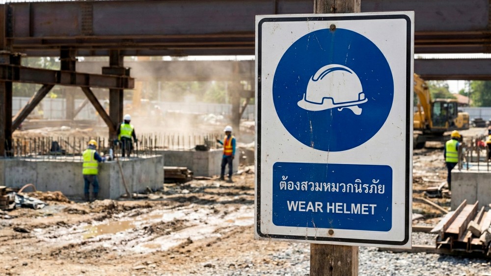
Blue safety signs are commonly used for mandatory signs, such as requiring safety helmets, safety glasses, or specified PPE. In standard terms, this color does not directly signal danger, but conveys "rules" or practices that everyone must follow without exception.
From a psychological perspective, blue conveys a calm, composed, and formal feeling, which is suitable for communicating regulations. At the same time, this very calmness causes blue safety signs to lack the power to demand attention.
On the actual worksite, blue safety signs are often the most overlooked. I have seen many areas with mandatory PPE signs posted strictly by the book, yet quite a few workers comply only when a supervisor is watching. Once out of sight, helmets come off and glasses are removed, even though the signs remain right there. One common reason we find is that blue safety signs do not connect in workers' minds to "consequences"—what happens if they don't comply. When the brain doesn't visualize an immediate risk, the sign becomes just another rule on the wall, not something requiring immediate action.
Therefore, the issue with blue safety signs is not a poor choice of color, but an application lacking context. Mandatory signs work much better when placed near the actual hazard—such as a sign to wear safety glasses right before a metal grinding station, rather than at the factory entrance, or a hard hat sign where there is overhead fall risk, rather than grouped onto a single large panel. Another helpful insight from field experience is using immediately recognizable symbols instead of lengthy text, because in rushed situations, workers don't have time to read, but process images and colors much faster.
When blue safety signs are linked to real risks and positioned where people must make immediate decisions, a color once overlooked will regain its meaning and perform its function noticeably better.
Green Safety Signs: Truly Safe, or Just False Reassurance?
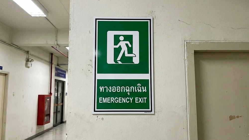
Green safety signs are used for fire exit signs, first aid stations, or emergency equipment. This color provides a feeling of safety, relief, and signals that "here is the way out" or "here is help in an unexpected event." Under normal conditions, green may not look exciting or eye-catching compared to red or yellow, but in an emergency, green is the color the human brain automatically searches for, as it is ingrained in memory as the color of survival.
However, from our field experience, green holds value only when workers can actually "remember its location," not just know that a sign is posted somewhere in the area. If signs are mounted merely to tick a compliance box—without communication, fire drills, or ever physically pointing out where the fire escape is—the green sign becomes just an attractive placard that nobody recalls in a critical moment.
We once encountered a minor emergency with smoke rising in one area. Several workers froze—not because they didn't want to evacuate, but because they weren't sure which way the fire exit was, even though green signs compliant with standards were mounted along the walls. Incidents like this clearly show that signs "once seen" do not equal signs "remembered." Another common issue is that many green safety signs are designed for visibility under normal lighting without considering realistic conditions, such as power outages, thick smoke, or crowds blocking the line of sight. Under such conditions, signs that are non-photoluminescent, unlit, or partially obscured disappear immediately.
Many factories that manage green signs effectively don't stop at just putting up signs; they make them part of familiar routine. For example, using green floor markings leading to fire exits, physically showing new workers where first aid stations are, or conducting fire drills where everyone follows green safety signs at least once a year. Ultimately, green fulfills its role completely only when it isn't just a "mandated sign," but a trusted symbol that frontline workers know to look for first whenever something happens.
Safety signs with the right color in the wrong place are just as dangerous as not having one at all
No matter how standard-compliant the color of a safety sign is, if it is placed at the wrong eye level, against the flow of foot traffic, or hidden behind machinery, it is practically useless. The human brain only registers what lies within its line of sight and at the critical moment of making a decision.
We have all seen warning signs mounted on the back of a door—only visible after walking through—even though the real hazard was in front of that very door. In such cases, no matter how bright red or distinct the symbol is, it cannot help anyone in time because the sign is one step behind the risk.
The placement of a safety sign is just as critical as its color. An effective safety sign should be at normal eye level, aligned with people's actual walking paths, and always located "before" the danger zone to give the brain enough time to perceive, pause, and adjust behavior.
On well-managed jobsites, safety signs are placed like visual traps: impossible to miss when walking forward, still visible when turning, and noticed before hands or feet step into a hazardous area. This is the difference between signs posted merely to check a box and safety signs installed to genuinely prevent accidents.
Summary
Safety sign colors are more important than you think, but they are not the whole answer. It is not just about meeting regulatory standards; it is a communication tool that directly impacts workers' lives. A good sign is not one that ticks every box on paper, but one that people see, understand, and immediately alter their behavior for.
When investing in safety signs, the question to ask is not just "Does this comply with standards?" but rather "When on-site workers see this color, what will they do next?" Because in the split second before an accident occurs, the sign's color might be the only warning that reaches you in time.
Select Safety Signs to suit the application