


 EN
 ไทย


Customers Also Purchased

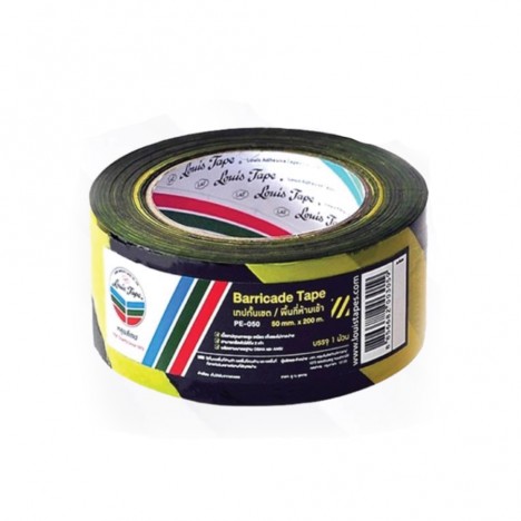
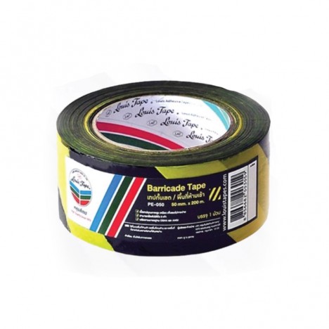
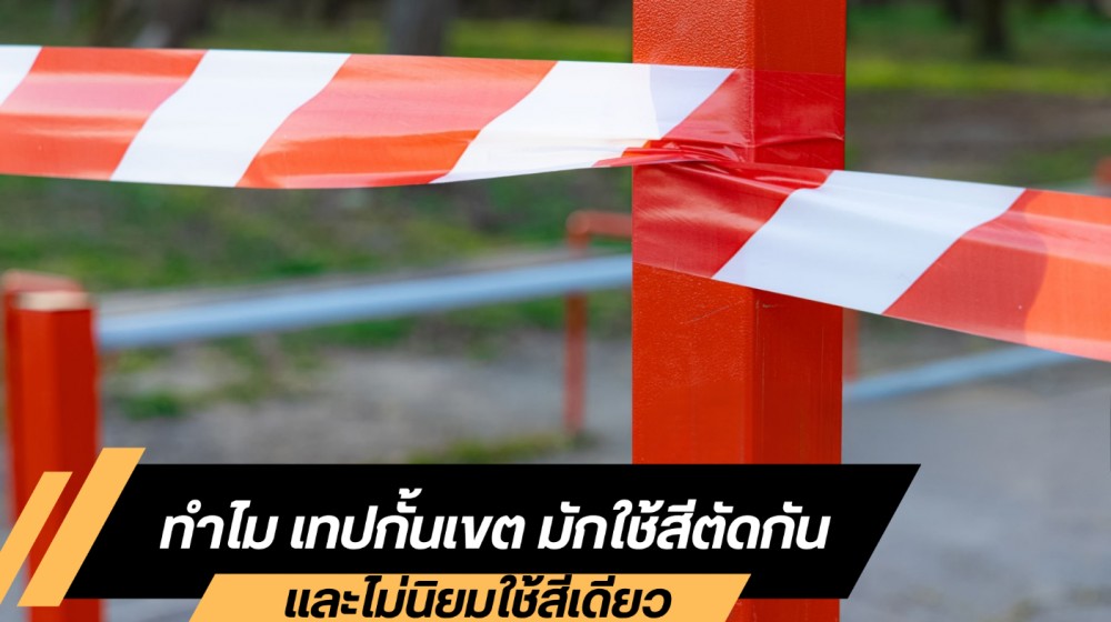
Have you ever noticed or wondered... why Barricade tape that we see at construction sites, roadworks, or hazardous areas almost always features sharply contrasting colors, such as yellow-black or red-white, and almost never a solid single color? That's because the moment our eyes catch sight of these tapes—no matter how far away—we instantly recognize that this is an area requiring caution, without having to read any signs or messages. The color contrast makes the tape eye-catching, draws attention, and sends a warning signal to the brain that "there is a risk here" and it should not be crossed. This article takes an in-depth, easy-to-understand look at the reasons and principles behind the use of color in barricade and traffic tapes.
Contrasting Colors and Visual Catchiness
A key reason barricade tape must use contrasting colors comes from the principle known as High Contrast, or sharp color differences clearly visible to human vision. This principle states that color pairs positioned opposite each other on the color wheel, such as yellow-black or red-white, stand out more than other combinations. This makes them easy to spot and eye-catching even in low light or poor weather conditions such as fog, dust, or drizzle, making them ideal for high-safety areas.
Imagine if we used a single-color barricade tape, such as gray placed on a concrete floor or green on a lawn; the color would blend into the background, causing visibility to virtually disappear. People might walk into the area without noticing and easily cause an accident. Color difference is therefore not just about aesthetics, but acts as a lifeline signal that tells people to stop, think, and beware before crossing into that area.
Visual Psychology and Warning Signals
Human responses to color do not occur by accident; they are the result of millions of years of evolution, enabling our eyes and brains to intuitively recognize and interpret certain colors very quickly:
- Red: Warns of danger, stop, and hazard. It is linked to intense stimuli such as fire, blood, or extreme heat, which historically signaled situations that needed immediate avoidance.
- Yellow: Communicates caution and alertness. It is highly visible even from a distance, resembling the color of sunlight, venomous creatures, or changing leaves signaling danger.
- Black: Adds weight and seriousness to warning signals, making the meaning of the paired colors stand out more clearly and urgently.
When these colors are paired on barricade tape or traffic tape, such as yellow–black or red–white, the brain processes it immediately and interprets it as “this area poses a hazard” without needing any accompanying text. This type of communication is therefore highly effective in situations that require rapid awareness, such as construction zones, road work, or hazardous areas.
The Difference Between Single Colors and Contrasting Colors
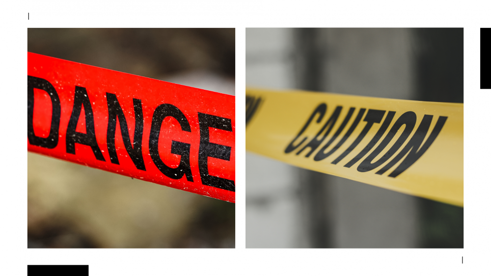
Single-color barricade tape is often not enough to attract attention because a color that blends into the background makes it hard to see. For example, using green in a garden or gray on a concrete road results in the color blending with the surroundings to the point where it is barely noticeable that tape is even there. This can lead pedestrians or drivers to pass through without being careful. In contrast, using contrasting colors like yellow–black or red–white makes the barricade tape stand out every time it is seen. Whether you are indoors in dim lighting or outdoors on a bright, sunny day, contrasting colors also help the tape remain clearly visible from a distance and even in environments with visual distractions such as dust or rain, allowing observers to instantly recognize that the area has restrictions or hazards.
Examples of Using Contrasting Colors in Barricade Tape
- Yellow–Black: Used to warn of general hazard areas, such as uneven floors, wet surfaces, stair edges, or zones under repair. Suitable for signaling to slow down and exercise extra caution.
- Red–White: Used for severe hazards or strictly prohibited areas, such as chemical zones, accident sites, and high-risk work areas, instructing people to stop and not cross the line.
- Green–White: Used to indicate safe routes, such as fire escape routes, first aid stations, or assembly points during emergencies, helping people navigate even in chaotic environments.
- Blue–White: Used to indicate specific mandatory requirements, such as wearing personal protective equipment (PPE) before entering a work zone, or to display specific area regulations for maximum safety.
Barricade Tape and Safety Standards
The choice of colors for barricade tape and traffic tape is not merely a matter of personal preference, but must comply with international safety standards such as OSHA or ISO. These standards clearly define color pairings and their applications for each situation so that people across all countries interpret the colors consistently, reducing confusion or mistakes during emergencies—such as using red–white for prohibited entry into hazardous areas, or yellow–black to warn of general hazards.
Visibility in Real-World Situations
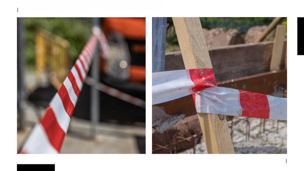
In chaotic environments filled with visual distractions—such as roadwork with passing vehicles, crowded events, or emergencies requiring rapid evacuation—barricade tape and traffic tape serve as essential tools to effectively establish a safety perimeter for both workers and the general public. Distinct contrasting colors act like large warning signs that are instantly understood without words. A mere glance is enough to recognize that the area ahead has restrictions or hazards, helping to reduce the risk of accidents such as collisions, trips and falls, or unintentionally wandering into unsafe zones.
Barricade Tape in Terms of Space Management
In addition to safety, the contrasting colors of barricade tape serve as a highly effective tool for organizing spaces. For example, they are used to divide work zones in factories to keep pedestrians and machinery separate, segregate material storage areas from walkways for safe and orderly transport, or designate no-parking zones in parking lots to reduce congestion and improve traffic flow. Using contrasting colors ensures boundaries are clearly visible in any environment, thereby aiding site management, reducing confusion, and making compliance easier for everyone.
A Visual Memory That Creates Safety
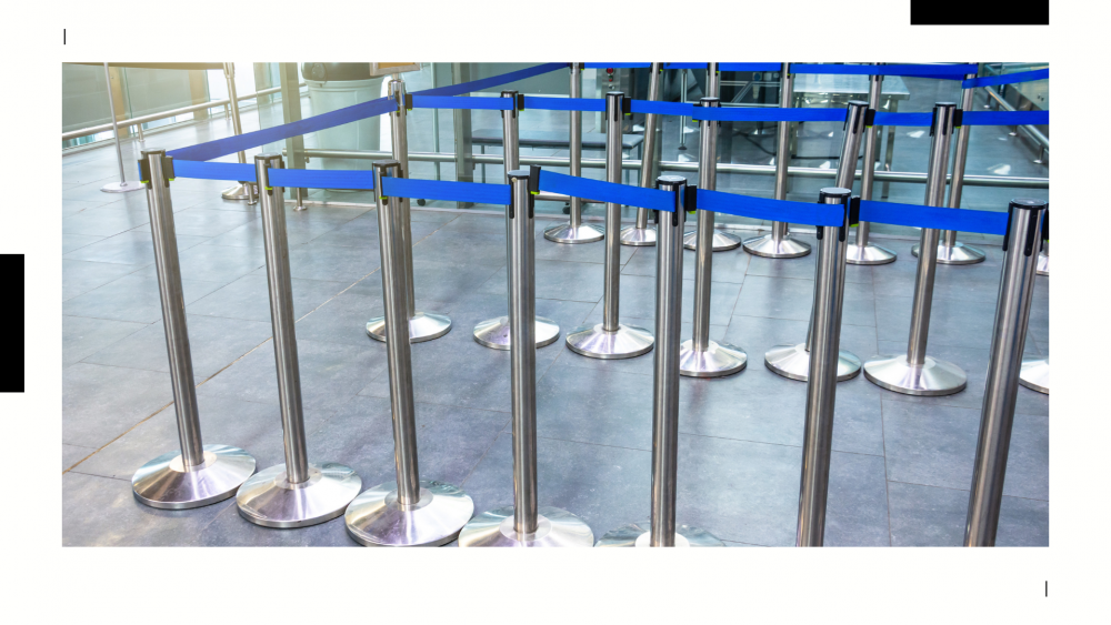
In many situations, just catching a glimpse of the barricade tape's colors is enough to make us slow down or stop walking without having to think. Our brains have grown so accustomed to these color patterns that they have become universal symbols for areas requiring caution. Even without warning signs or personnel on hand to give instructions, spotting contrasting colors on barricade tape acts as a clear signal to stop or steer clear. The use of contrasting colors is therefore not just for aesthetics, but functions as an advance warning and establishes respect for designated boundaries, ensuring everyone stays safe and can easily comply.
Conclusion
Barricade Tape and Traffic Tape Contrasting colors are used because they deliver an immediate, eye-catching signal that is quickly visible even from a distance or in unfavorable lighting conditions, communicating directly with our brains that restrictions or hazards lie ahead. This represents a blend of human psychology—understanding color perception—and safety engineering designed for practical use in any situation, empowering observers to make the right, safe decisions.